Storybook is the industry standard workshop for building, documenting, and testing UI components in isolation
Build and share delightful machine learning apps, all in Python. Star to support our work!
Open-source Tailwind CSS component library. Use Tailwind CSS but write fewer class names.
Skeleton is an adaptive design system powered by Tailwind CSS.
A set of headless, accessible component builders for Svelte.
Mobile UI components made with Tailwind CSS
Beautiful JavaScript notifications with Web Notifications support.
The headless components for Svelte.
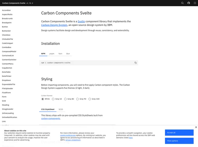
Svelte implementation of the Carbon Design System
Svelte implementation of the Carbon Design System
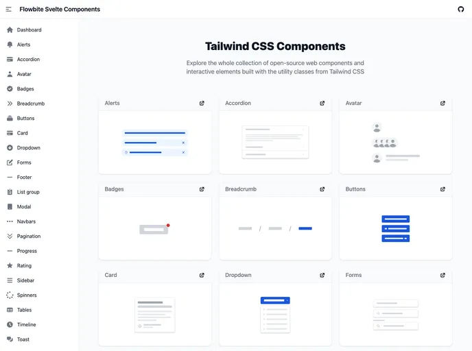
Official Svelte components built for Flowbite and Tailwind CSS
A mcp server to allow LLMS gain context about shadcn ui component structure,usage and installation,compaitable with react,svelte 5,vue & React Native
The easiest, free and open-source Tailwind CSS component library with semantic classes.
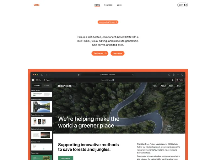
Component-based CMS with a built-in IDE, visual editing, and static site generation. One server, unlimited sites.
Component-based CMS with a built-in IDE, visual editing, and static site generation. One server, unlimited sites.
Component-based CMS with a built-in IDE, visual editing, and static site generation. One server, unlimited sites.
Component-based CMS with a built-in IDE, visual editing, and static site generation. One server, unlimited sites.
A Svelte.js based UnoCSS UI library that allows you to make websites
[DEPRECATED, see readme] A pretty cool UI kit for Svelte
Notus Svelte: Free Tailwind CSS UI Kit and Admin
Mobile web component library based on Svelte and Tailwind
Mobile web component library based on Svelte and Tailwind
A faithful implementation of Microsoft's Fluent Design System in Svelte.
A Material UI Design Component library for Svelte heavily inspired by vuetify.
Amazing DaisyUI components you can copy and paste
Amazing DaisyUI components you can copy and paste
Implements the Material 3 design system in Svelte, cleanly, robustly, and across disciplines.
A library of accessible component primitives, actions and utilities for Svelte.
Fulldev UI is a component library for Astro and content-driven websites.
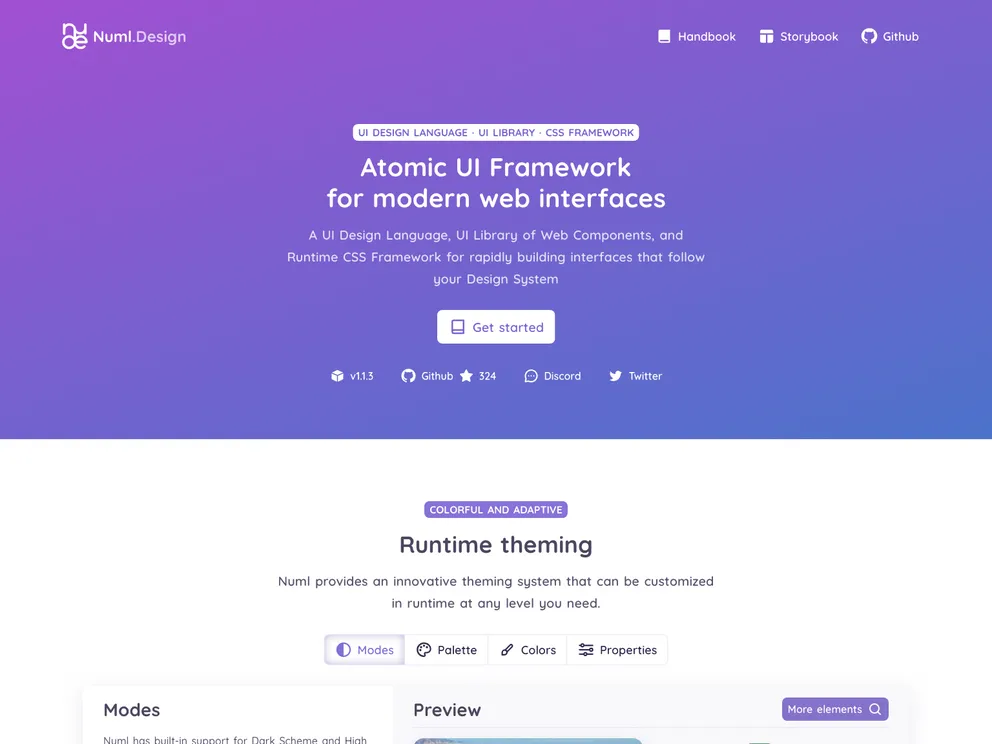
Atomic UI Framework based on Web Components and Runtime CSS Generation for rapidly building interfaces that follow your Design System
Decathlon Design System UI components for web applications
Svelte UI components based on super lightweight chota CSS framework.
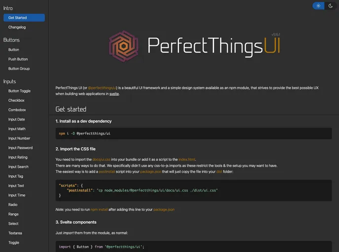
A Svelte 5 UI component library, inspired by Vercel's Geist, thoughtfully designed to deliver consistent and cohesive web experiences.
YeSvelte UI component library for Svelte
A Svelte component library wrapping UI elements from Tweakpane, plus some additional functionality for convenience and flexibility.
PaperCSS components for Svelte
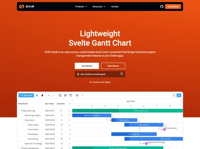
Svelte Gantt chart component – lightweight, customizable, interactive, and fast.
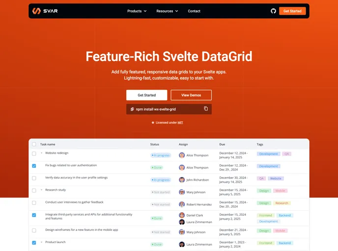
Svelte datagrid component. Lightweight, fast, feature-rich.
Straight-forward Svelte UI for the Web
A simple library for building delightfully animated stepped flows with Svelte.
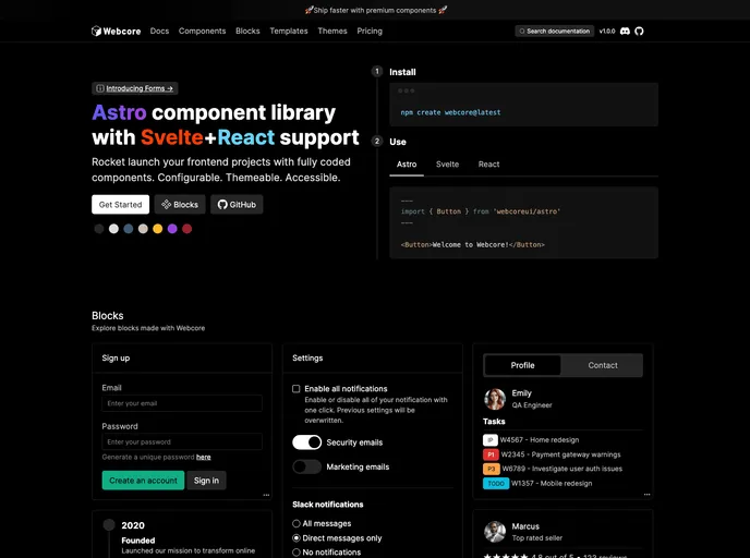
Customizable Astro UI component library styled with Sass, with Svelte and React support.
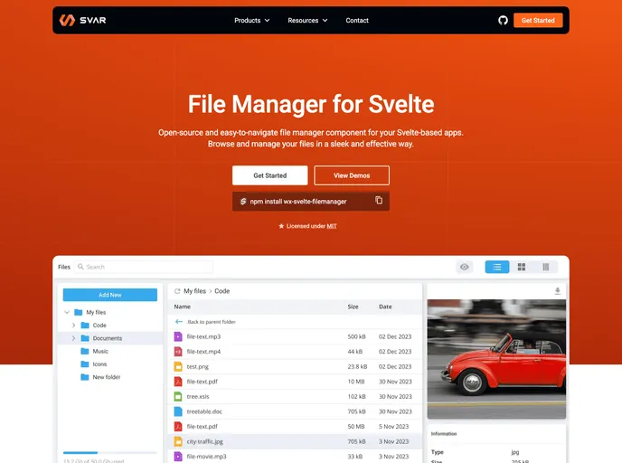
Easy-to-use Svelte file manager (file explorer) component
Svelteit is a minimalistic UI/UX component library for Svelte and Sapper projects
This package provides the Simple Icons packaged as a set of Svelte components.
The elemental UI component library for Svelte, built with UnoCSS and Melt UI.
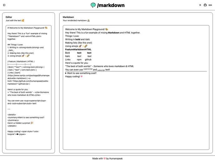
Fast, lightweight Markdown renderer component for Svelte applications with full CommonMark support
A fork of fluent-svelte which is in active development
A collection of client side patterns for faster and easier web development
An ui components lib that supports React17+, Vue3+ and Svelte3+
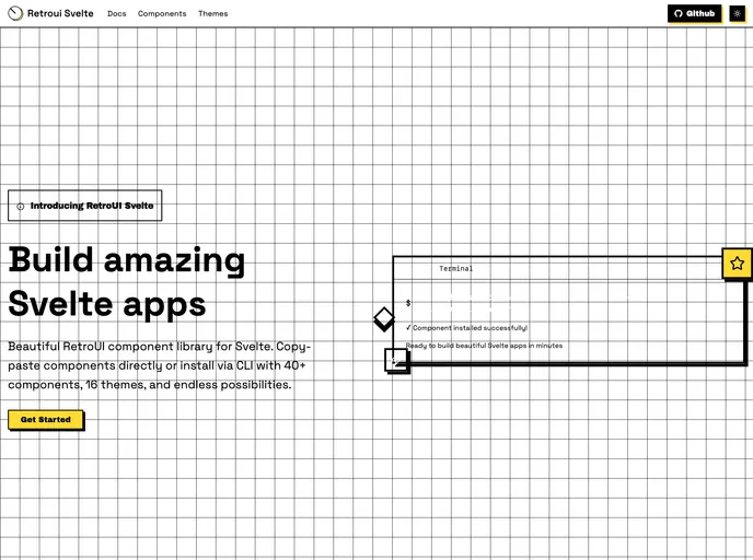
A retro-styled UI component library for Svelte applications.
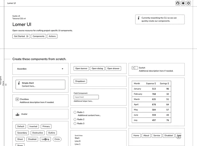
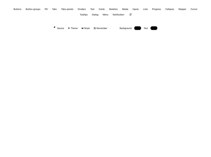
Open-source resource for crafting project-specific UI components using Svelte & Tailwind CSS.
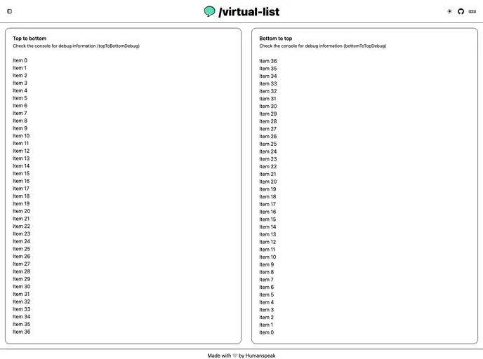
A performant virtual list/scrolling component for Svelte applications - efficiently render large scrollable lists with minimal memory usage
UI component library for Svelte based on Apple's Human Interface design language.
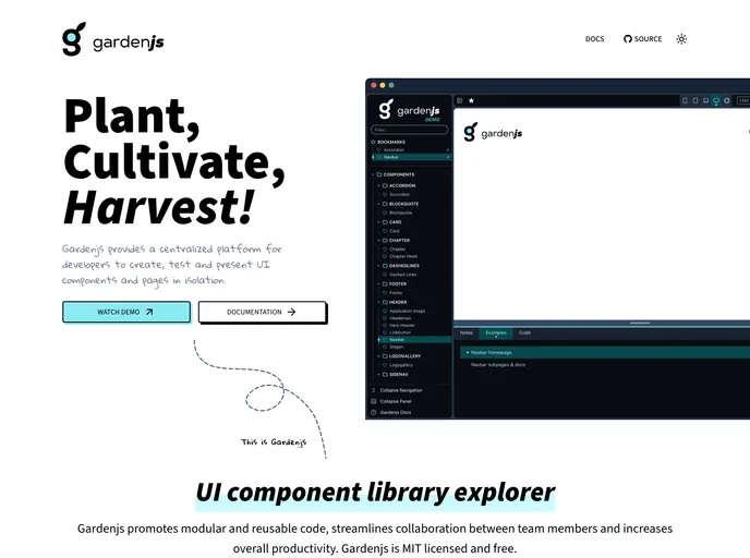
Component library explorer for UI development, testing and documentation.
A set of composable, data-driven and themeable UI components.
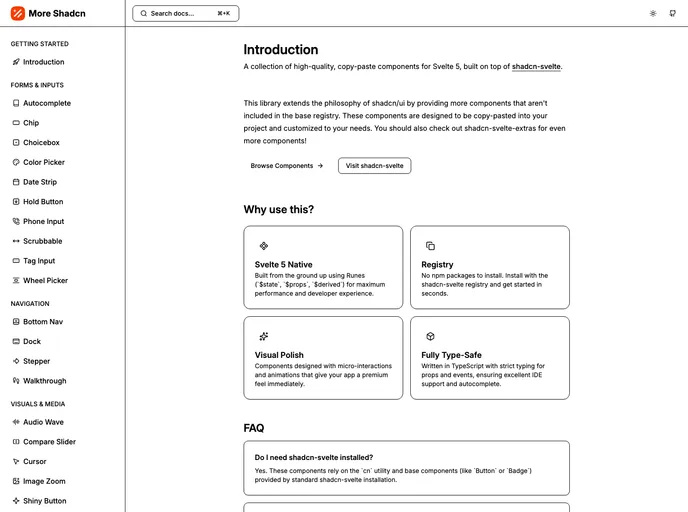
Collection of new shadcn-svelte components
Neomorphic ui library for svelte 5
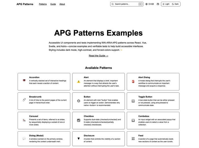
Accessible UI component implementations across React, Astro, Svelte, Vue, and Astro following WAI-ARIA APG patterns
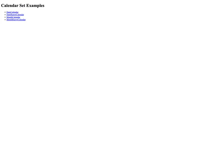
Framework agnostic calendar components
Responsive components built with Svelte & Tailwindcss
Unofficial Svelte port of flowbite-react
A very casual ui components library for svelte
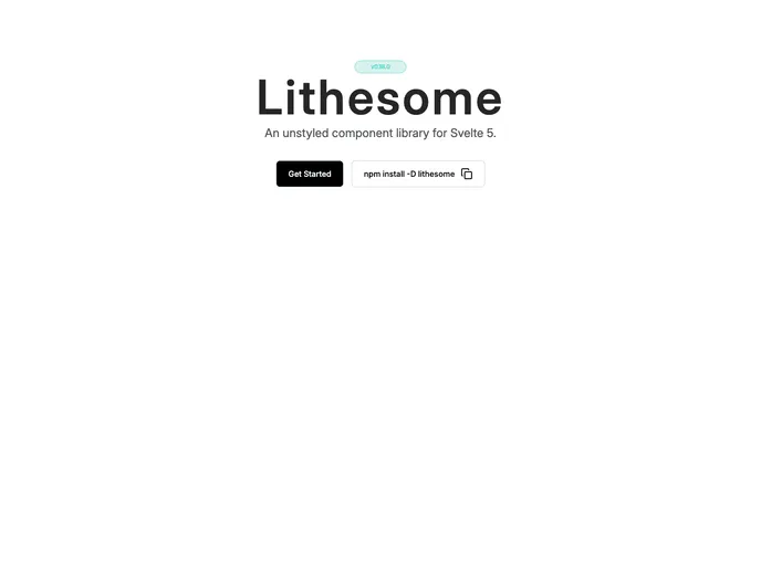
An unstyled component library for Svelte 5.


